
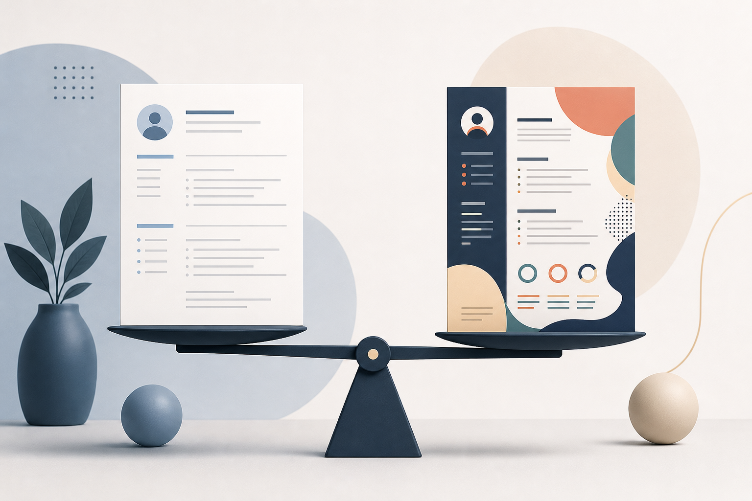
Introduction: do fancy resume templates hurt your chances?
Resume templates are everywhere, especially Canva-style designs that promise a modern, eye-catching look. The real question is practical: do fancy resume templates hurt your chances with applicant tracking systems (ATS) and recruiters who skim fast. In many cases, yes, they can. Not because recruiters hate design, but because parsing errors can hide your experience, scramble dates, or drop keywords that help you get shortlisted.
This article is Real Talk. A plain document often outperforms a stylish one for a simple reason: it survives the ATS and reads cleanly on any screen. Still, you do not need a blanket ban on design. You need a safe-template checklist and a few formatting rules that protect your content while keeping the resume professional.
Why fancy designs can break ATS parsing
Most companies use an ATS to collect applications, store resumes, and help recruiters search. Even when a human reviews your resume, it often passes through parsing first. Parsing is the process of turning your PDF or DOCX into structured fields like job titles, employers, dates, skills, and education.
What ATS parsing is trying to do
An ATS parser is trying to answer predictable questions:
- What is your most recent role and employer?
- What are your dates of employment?
- What are your skills and tools?
- Can it map your content into standard sections like Experience and Education?
When your resume template uses decorative layout tricks, the parser can misread the structure. That can lead to missing or misplaced information, which can reduce your match score or make your resume harder to search.
Common Canva-style template problems
Many modern templates are built like posters. They look great visually, but they are not built for machine readability.
Here are the most common issues that hurt ATS performance:
- Text boxes everywhere: Content placed in floating text boxes can be read out of order or skipped.
- Multiple columns: Two-column resumes often cause the ATS to read across rows incorrectly, mixing unrelated text.
- Icons instead of labels: A phone icon or LinkedIn icon may not parse as “Phone” or “LinkedIn.”
- Graphics for skills: Bars, dots, and charts are often invisible to parsers.
- Headers and footers: Some ATS tools ignore header and footer content, which is where templates often put contact info.
- Unusual section headings: “Where I have been” instead of “Experience” can confuse section mapping.
- Creative fonts and ligatures: Some fonts render oddly when converted, creating garbled text.
Important: Even if your resume “looks fine” when you open the PDF, the ATS may see a very different version.
Real Talk: when a pretty resume costs you interviews
A fancy template rarely gets you hired. Your content gets you hired. The template’s job is to make that content easy to parse and skim.
Here is what can happen with a design-heavy resume:
- Your job titles and company names get merged into one line.
- Your dates drift to the wrong role, making your timeline look inconsistent.
- Your skills appear as blank space because they were in a graphic.
- Your resume becomes hard to search, so you do not appear when a recruiter filters for “SQL” or “stakeholder management.”
A quick scenario you can recognize
You apply for a role that wants “project management, cross-functional leadership, Jira.” You have all of that, but your template lists tools in a sidebar with icons and progress bars. The ATS extracts only your job bullets and misses the sidebar entirely.
Result: the recruiter searches for “Jira” and your resume does not show up. You were qualified, but invisible.
Which design elements usually survive ATS?
You can still create a resume that looks polished. The key is using formatting that is both machine-readable and human-friendly.
ATS-safe design elements
These are typically safe and help readability:
- Single-column layout
- Standard section headings: Summary, Experience, Education, Skills, Projects
- Bold for job titles and companies
- Consistent font in a common family (Calibri, Arial, Helvetica, Times New Roman, Georgia)
- Simple bullet points (round or dash bullets)
- Minimal lines for separation (use sparingly)
- Black text with subtle gray for secondary details (as long as contrast is strong)
Design elements that are risky
These often cause parsing problems:
- Two columns or complex grids
- Text boxes and shapes
- Icons for contact info or skills
- Skill graphs, rating bars, and infographics
- Photos, logos, and background images
- Tables (some parse fine, many do not)
If you want “modern,” aim for typography and spacing, not layout tricks.
Plain documents often outperform because recruiters skim
Even when ATS is not the blocker, the human skim is. Recruiters often spend a short amount of time on the first pass. You want your resume to answer, quickly:
- What do you do?
- What have you done recently?
- What outcomes did you drive?
- Do you match the role’s must-haves?
A simple format helps your strongest points land fast.
What “plain” should mean
Plain does not mean sloppy. It means:
- Clean hierarchy: name, headline, summary, experience
- Clear dates and locations
- Quantified outcomes where appropriate
- Keywords used naturally in context
A plain document is also easier to tailor for each application, which matters more than design.
The safe-template checklist (use this before you apply)
This is the practical part. You do not need to ditch every template. You need to test it.
Checklist: ATS-safe resume template
Use this checklist to evaluate any resume template, including Canva exports.
- Single column
- Your content should flow top to bottom.
- No text boxes for core content
- Experience, education, and skills should be typed directly in the document body.
- No icons required to understand meaning
- Write “Phone:” and “LinkedIn:” as text.
- Standard headings
- Use “Experience” not “My Journey.” Use “Skills” not “Toolbox.”
- Contact info not in header or footer
- Place it in the main body near the top.
- Skills listed as text
- Example: “SQL, Tableau, Jira, stakeholder management.” No bars.
- Consistent date format
- Example: “Jan 2023 to May 2025” or “2023 to 2025.” Pick one.
- PDF export that preserves selectable text
- You should be able to highlight and copy your text from the PDF.
- Readable font and size
- Typically 10.5 to 12 pt for body text, with clear spacing.
- Simple bullets and punctuation
- Avoid special symbols that might convert poorly.
Two quick tests you can run in five minutes
Test 1: copy-paste test
- Open your resume PDF.
- Select all text, copy, and paste into a plain text editor.
If the pasted result is out of order, missing sections, or jumbled, your template is risky.
Test 2: ATS preview test
If you want a faster signal on how your resume is being interpreted, run it through a resume checker and look for missing fields or misread dates. You can use a free scan like https://primly.io/resume-score to spot parsing and keyword issues quickly.
How to keep a modern look without breaking ATS
If you like design, you can still have it. You just need to use safe choices.
Use typography and spacing as your “design”
Instead of columns and graphics, use:
- A strong headline under your name: “Customer Success Manager | B2B SaaS | Renewals and Expansion”
- Bold job titles and company names
- White space between roles
- A subtle line under section headings
This reads modern and stays machine-friendly.
Keep your resume sections predictable
ATS systems and recruiters both benefit from predictable structure. A solid order is:
- Header with contact info
- Summary (optional but helpful for career changers)
- Skills (short, keyword-aligned)
- Experience (most space)
- Education
- Projects or Certifications (if relevant)
If you are early-career, swap Education and Experience depending on what is stronger.
Make your resume support behavioral interviews, not just ATS
A resume is not only an application document. It is your interview script. If your resume is clean and outcome-focused, it becomes easier to answer behavioral questions using the STAR method.
Build bullets that convert into STAR stories
When you write bullets, you are creating mini-stories you can expand in interviews.
A strong bullet includes:
- The problem or goal
- What you did
- The result
- The tools or skills used
Example bullet:
- “Led a cross-functional onboarding redesign, reduced time-to-first-value by simplifying handoffs and updating enablement materials.”
In an interview, you can turn that into STAR.
STAR example you can use (based on a resume bullet)
Notice what makes this interview-ready: it is specific, it shows ownership, and it connects actions to outcomes. A clean resume template makes these bullets easy to find and talk through.
If you already have a fancy template, here is how to salvage it
You might not want to start over. You can usually keep the aesthetic while removing the risky parts.
Step-by-step: convert a design-heavy resume into an ATS-safe version
- Create a plain master copy in Google Docs or Word
- Single column, standard headings.
- Move all sidebar content into main sections
- Skills and certifications become simple lists.
- Replace icons with text labels
- “Email: name@email.com”
- Remove charts and graphics
- Convert to text. Example: “Advanced: Excel, SQL. Intermediate: Tableau.”
- Export to PDF and run the copy-paste test
- Fix ordering issues before you apply.
- Keep a “pretty” version only for networking
- If you love design, use it when emailing a hiring manager directly. For ATS portals, use the safe version.
When a designed resume can help (rare, but real)
There are cases where design matters more:
- Graphic design, brand design, some marketing roles
- Roles where your resume itself is a work sample
Even then, you often need two assets:
- An ATS-safe resume for applications
- A portfolio or designed PDF for humans
If you are in a design-heavy field, put your energy into the portfolio. Keep the resume readable.
Practical template recommendation: what to use instead of Canva grids
You do not need to buy templates. A strong approach is:
- Start with a standard Word or Google Docs resume
- Use one font, clear headings, and consistent spacing
- Save as PDF for submission unless the application asks for DOCX
If you want a template, choose one that is clearly single-column and built in Word or Docs, not one composed of text boxes.
Conclusion: choose readability and parsing over decoration
Fancy resume templates can hurt your chances when they break ATS parsing or slow down recruiter skimming. A plain document often wins because it is reliably readable, easy to search, and easy to tailor.
Use the safe-template checklist instead of a blanket ban. Keep your layout simple, your headings standard, and your skills in text. Then put your energy into what actually drives interviews: clear, outcome-based bullets that you can expand into STAR stories during behavioral interviews.
If you want a quick sanity check, run your file through a resume scan like https://primly.io/resume-score and confirm that your experience, dates, and skills are being extracted cleanly.
Your goal is not to impress with design. Your goal is to get shortlisted, then walk into the interview with stories your resume already supports.