
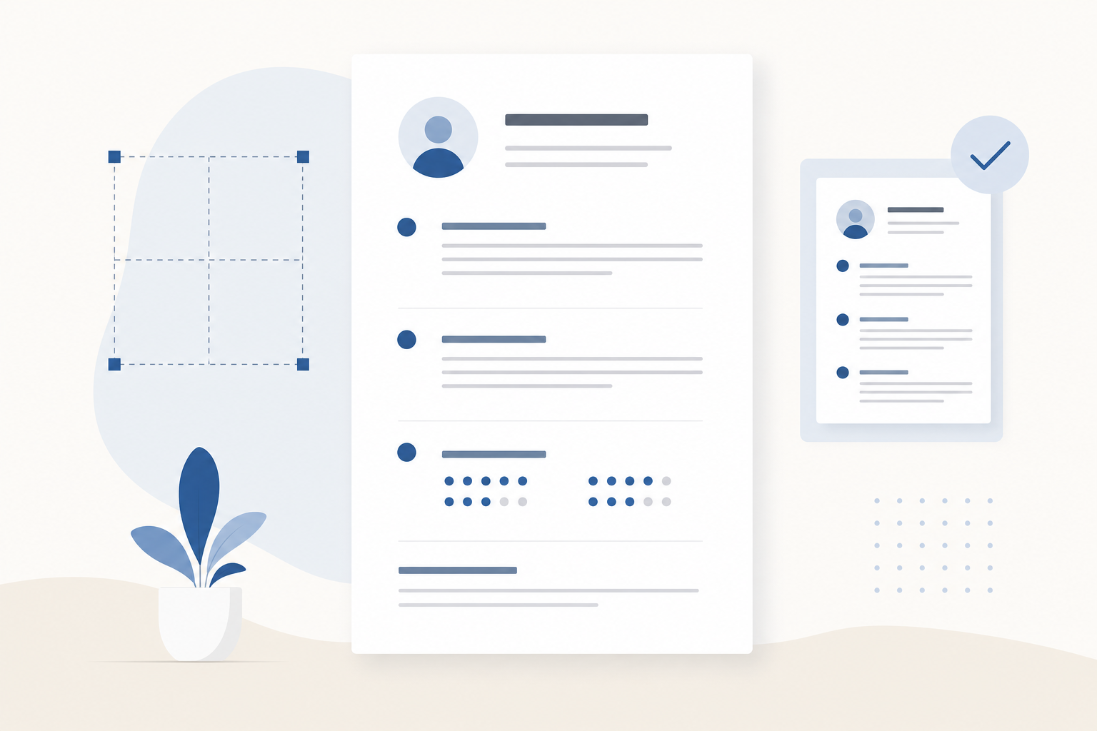
Introduction: resume white space and layout rules you can measure
Resume white space and layout can be the difference between a recruiter skimming confidently and missing your strongest wins. If you are not a designer, vague advice like “make it clean” is not helpful. You need concrete resume formatting specs you can apply in minutes.
This guide gives you 7 measurable checks for resume margins, font sizes, line spacing, one font family, and bold usage. You will be able to audit your resume like a checklist. The goal is simple: make your resume easy to scan so your behavioral interview stories, impact, and leadership show up fast.
Important: These rules are optimized for readability and ATS compatibility. They also help humans find your STAR-ready achievements quickly.
Why white space matters for behavioral interview prep
Behavioral interviews are about evidence. Your resume is often the first “evidence packet” a recruiter and hiring manager sees. If your layout is dense or inconsistent, they spend attention decoding formatting instead of noticing outcomes.
Good white space does three things:
- Creates hierarchy so your most important information appears first.
- Improves scan speed so the reader finds role titles, dates, and impact bullets quickly.
- Signals judgment because clean formatting suggests you can communicate clearly.
When your resume is scannable, it is easier for an interviewer to pull questions from it. That helps you steer toward your strongest STAR stories.
The 7 measurable resume layout checks (audit checklist)
Use these checks as hard rules. If your resume passes all seven, it will look clean without needing design skills.
Check 1: Margins are consistent and within a safe range
Target spec:
- 0.5 to 0.75 inches on all sides (top, bottom, left, right)
Why it works:
- Below 0.5 inches looks cramped and can print poorly.
- Above 0.75 inches wastes space and can push key content to page two.
Quick audit:
- Open your resume in Word or Google Docs.
- Check page setup margins.
- Confirm all four sides match.
Common mistake: setting left and right margins tighter than top and bottom. That makes the page feel “squeezed” horizontally and harder to read.
Check 2: Use one font family for the entire resume
Target spec:
- One font family across headings, body text, and dates.
- Acceptable choices: Calibri, Arial, Helvetica, Garamond, Georgia, Times New Roman.
Why it works:
- Multiple fonts create visual noise and reduce perceived professionalism.
- One font family makes your hierarchy depend on size and weight, which is easier to control.
Quick audit:
- Select all text and apply a single font.
- If you need contrast, use bold and font size changes, not a second font.
Pro tip: If you are unsure, choose Calibri or Arial. They are readable on screens and common in ATS parsing.
Check 3: Font sizes follow a simple hierarchy
Target spec:
- Body text (bullets): 10.5 to 11.5 pt
- Section headings (Experience, Education): 12 to 14 pt
- Name at top: 16 to 20 pt
Why it works:
- Under 10.5 pt strains the reader and looks like you are trying to cram.
- Over 12 pt body text can make a one-page resume spill unnecessarily.
Quick audit:
- Pick one body size and apply it to every bullet.
- Pick one heading size and apply it to every section heading.
- Ensure your name is the largest element on the page.
Common mistake: mixing 10 pt, 11 pt, and 11.5 pt in different sections. It is subtle, but it makes the page feel inconsistent.
Check 4: Line spacing is readable, not airy or cramped
Target spec:
- Body line spacing: 1.0 to 1.15
- Space between bullet points: 0 to 4 pt
- Space between roles (job blocks): 8 to 14 pt
Why it works:
- Tight line spacing makes bullets blur together.
- Excessive spacing makes your resume look empty and forces content onto another page.
Quick audit:
- Select all bullet text.
- Set line spacing to 1.1 (a safe default).
- Set paragraph spacing after bullets to 2 pt.
- Add larger spacing only between distinct blocks (like between jobs).
Rule of thumb: spacing should communicate structure. Small spacing separates bullets. Medium spacing separates roles. Larger spacing separates sections.
Check 5: Bullet indentation is consistent and aligned
Target spec:
- Bullet indent: 0.15 to 0.25 inches
- Hanging indent (where text wraps): 0.25 to 0.35 inches
Why it works:
- Consistent indentation creates straight vertical lines, which makes scanning effortless.
- Misaligned bullets make the page look messy even if the content is strong.
Quick audit:
- Look at your resume at 75 percent zoom.
- Your bullets should form a clean column.
- Wrapped lines should align under the first character of the bullet text, not under the bullet symbol.
Common mistake: manually using spaces or tabs. Use the paragraph indentation settings instead.
Check 6: Bold usage is intentional and limited
Target spec:
- Use bold for only 2 to 4 elements:
- Company name or job title
- Section headings
- Key metrics or outcomes inside bullets (sparingly)
- Keep bold coverage under roughly 10 to 15 percent of visible text on the page.
Why it works:
- Bold is a highlighter. If everything is highlighted, nothing stands out.
- Recruiters often scan for titles, companies, and impact. Bold helps them find those anchors.
Quick audit:
- Scroll through your resume and squint slightly.
- You should see a clear pattern: headings and role anchors pop. Bullets remain mostly regular weight.
Example: good bold inside a bullet
- Reduced onboarding time from 3 weeks to 8 days by rebuilding the training flow and adding manager check-ins.
Example: too much bold
- Reduced onboarding time from 3 weeks to 8 days by rebuilding the training flow.
Check 7: Your resume has a predictable scan pattern
This is the “does it feel easy?” check, but you can still measure it.
Target spec:
- Each role has a consistent block:
- Line 1: Job Title, Company, Location (optional)
- Line 2: Dates (right-aligned or same line, but consistent)
- Line 3: 2 to 5 bullets
- Bullet length: 1 to 2 lines per bullet most of the time.
- Bullets per role: 3 to 5 for recent roles, 1 to 3 for older roles.
Why it works:
- A consistent pattern reduces cognitive load.
- Shorter bullets force you to lead with impact, which sets you up for behavioral interview questions.
Quick audit:
- Count bullets in each role. If you have 8 to 12 bullets, you are likely listing tasks, not outcomes.
- Look for “walls of text.” If a bullet runs 3 to 4 lines, split it or tighten it.
Putting the checks into a 15-minute resume audit
Use this workflow when you want fast improvements without rewriting content.
Step 1: Fix the page geometry first
- Set margins to 0.5 to 0.75 inches.
- Choose one font family.
- Apply body font size 11 pt (a safe default).
This immediately improves readability and alignment.
Step 2: Normalize spacing and indentation
- Set bullet line spacing to 1.1.
- Set bullet spacing after to 2 pt.
- Set bullet indent and hanging indent consistently.
This removes the “random spacing” look.
Step 3: Re-apply hierarchy with headings and bold
- Set section headings to 13 pt bold.
- Make job title or company bold, not both if it becomes too heavy.
- Bold metrics sparingly.
Now your resume has clear anchors for scanning.
Step 4: Do the squint test and the 10-second test
- Squint test: Can you see section headings and role blocks clearly?
- 10-second test: If someone had 10 seconds, could they find your current title, last two companies, and your biggest impact?
If not, reduce bold noise, tighten bullets, or increase spacing between blocks.
White space mistakes that quietly hurt you
These are common issues that make a resume feel “off” even when the content is good.
Overstuffing to force one page
A one-page resume is often a good target, but not at the cost of readability. If you drop font size to 9.5 pt or margins to 0.3 inches, you are trading clarity for density.
Better options:
- Remove older, less relevant bullets.
- Combine similar roles.
- Trim summary and skills to what the job actually needs.
Centered layouts and heavy columns
Two-column resumes can look modern, but they often reduce ATS parsing accuracy and can be harder to scan on smaller screens.
If you are applying online, a single-column layout is the safest default.
Inconsistent date alignment
Dates jumping around the page create visual friction.
Pick one:
- Right-align all dates.
- Or keep dates on the same line after the company, separated by a pipe.
Just be consistent.
Make your layout support STAR stories (not fight them)
White space and layout are not just cosmetic. They help you surface accomplishments you can expand into behavioral interview answers.
Turn “busy” bullets into STAR-ready bullets
A good bullet hints at Situation, Task, Action, Result without telling a full story.
Before (task-heavy):
- Responsible for managing weekly stakeholder meetings and project updates.
After (STAR-ready):
- Led weekly stakeholder syncs for a cross-functional launch, unblocked 6 dependencies, and shipped on schedule with no critical escalations.
Layout supports this by keeping bullets short and scannable. The interviewer can point to that line and ask, “Tell me about that launch.” You are ready.
Use white space to separate impact areas
If you have mixed achievements in one role, group them naturally:
- 2 bullets for growth or revenue outcomes
- 2 bullets for operational improvements
- 1 bullet for leadership or mentoring
This structure makes it easier to pick a story for questions like:
- “Tell me about a time you influenced without authority.”
- “Tell me about a time you improved a process.”
A simple layout template you can copy
Use this as a structure reference, not a design.
If you follow the 7 checks, this template will look polished even with zero design work.
Optional: sanity-check your resume before you apply
After you fix layout, it can help to get a quick external read.
- If you want an automated check, you can use a free tool like Primly’s resume score to catch formatting and content gaps: https://primly.io/resume-score.
Do not treat any score as the truth. Use it as a prompt to review the sections that matter.
Conclusion: a clean resume is a readable resume
You do not need design skills to produce a professional resume. You need clear specs and consistency.
Run your resume through these 7 measurable checks:
- Margins: 0.5 to 0.75 inches
- One font family
- Font hierarchy: 10.5 to 11.5 body, 12 to 14 headings
- Line spacing: 1.0 to 1.15, predictable paragraph spacing
- Consistent bullet indentation
- Limited, intentional bold
- Predictable scan pattern with 3 to 5 strong bullets per role
When your layout is clean, your achievements are easier to find. That makes it easier for interviewers to ask about your best work and easier for you to deliver strong STAR answers.